Visualization Gallery
These charts come from the latest AmericanEconomy run artifacts and emphasize fiscal readability, world comparison, and executive review layouts.
These charts come from the latest AmericanEconomy run artifacts and emphasize fiscal readability, world comparison, and executive review layouts.
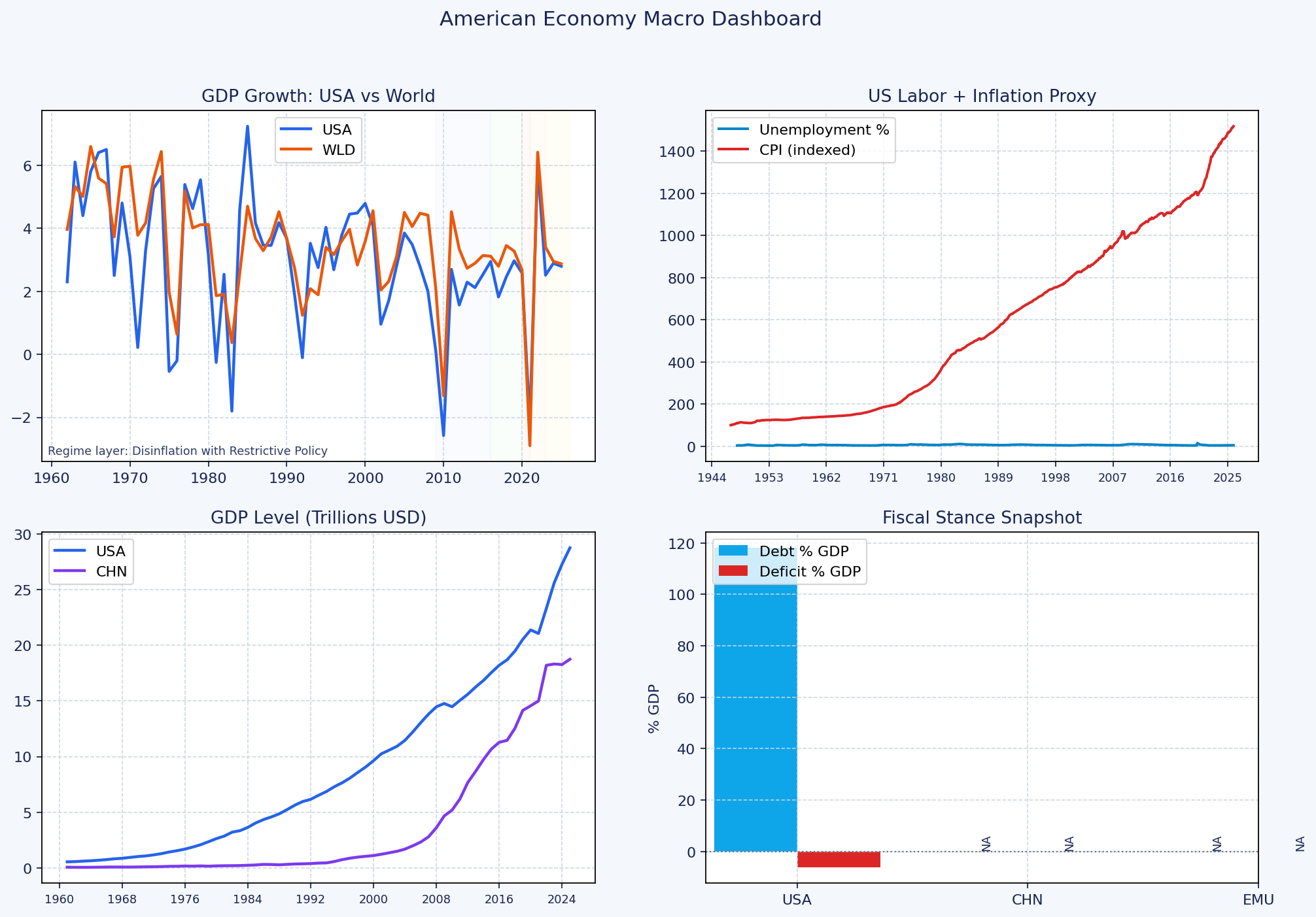
Executive 2x2 dashboard with growth, labor/inflation, GDP scale context, and fiscal stance snapshot.
Latest run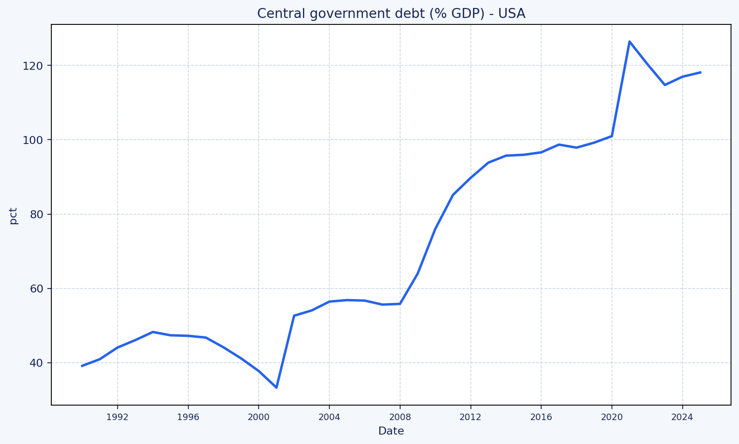
Time series of U.S. government debt as a percent of GDP.
1989-2024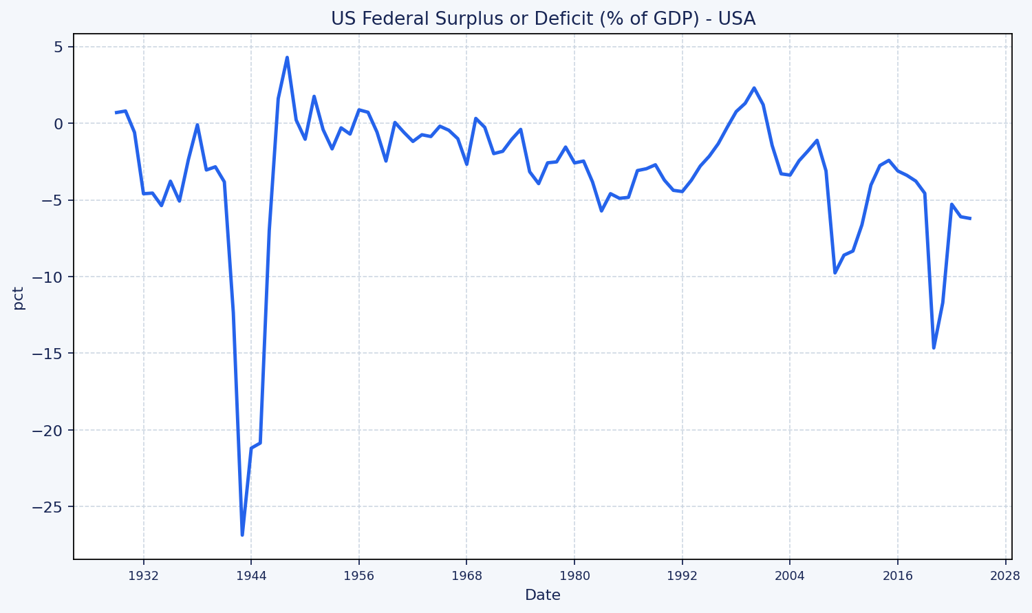
Federal surplus/deficit as a percent of GDP. Negative values indicate deficit.
1929-2024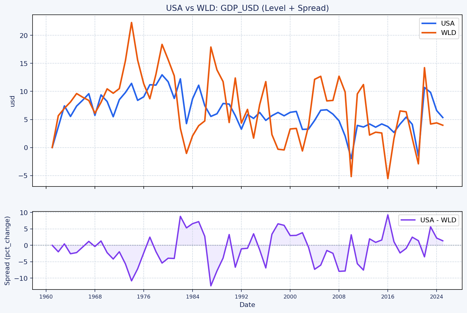
Comparison view with spread panel to make relative divergence easier to interpret.
World Bank annual series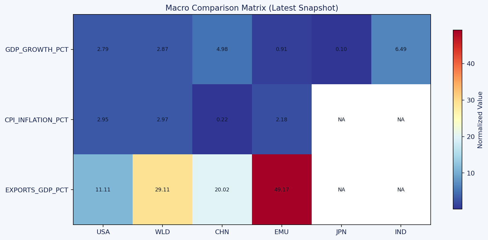
Cross-country matrix for fast scan of key indicators across major geographies.
Latest snapshotUse these local HTML outputs for drill-down. They are copied from the latest agent runs.
| Artifact | Description | Open |
|---|---|---|
| Interactive Macro Briefing | Plotly dashboard with fiscal panel and regime context. | open |
| Interactive Macro Matrix | Interactive heatmap matrix for cross-country indicator comparison. | open |
| Research Pack Index | Pack landing page with linked interactive views. | open |