Climate Visualizations
All visualizations generated by GlobalTemperature variation_8 tools using matplotlib. Charts show full available data ranges from authoritative sources (NASA, NOAA, NSIDC, OWID).
All visualizations generated by GlobalTemperature variation_8 tools using matplotlib. Charts show full available data ranges from authoritative sources (NASA, NOAA, NSIDC, OWID).
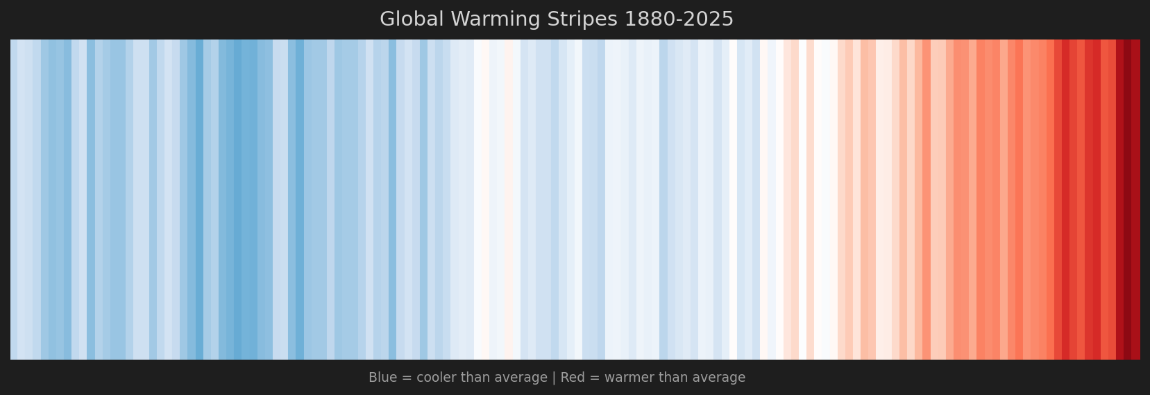
Ed Hawkins-style visualization. Each stripe = one year. Blue = cooler, Red = warmer than 1850-1900 average.
1880-2025 (146 years)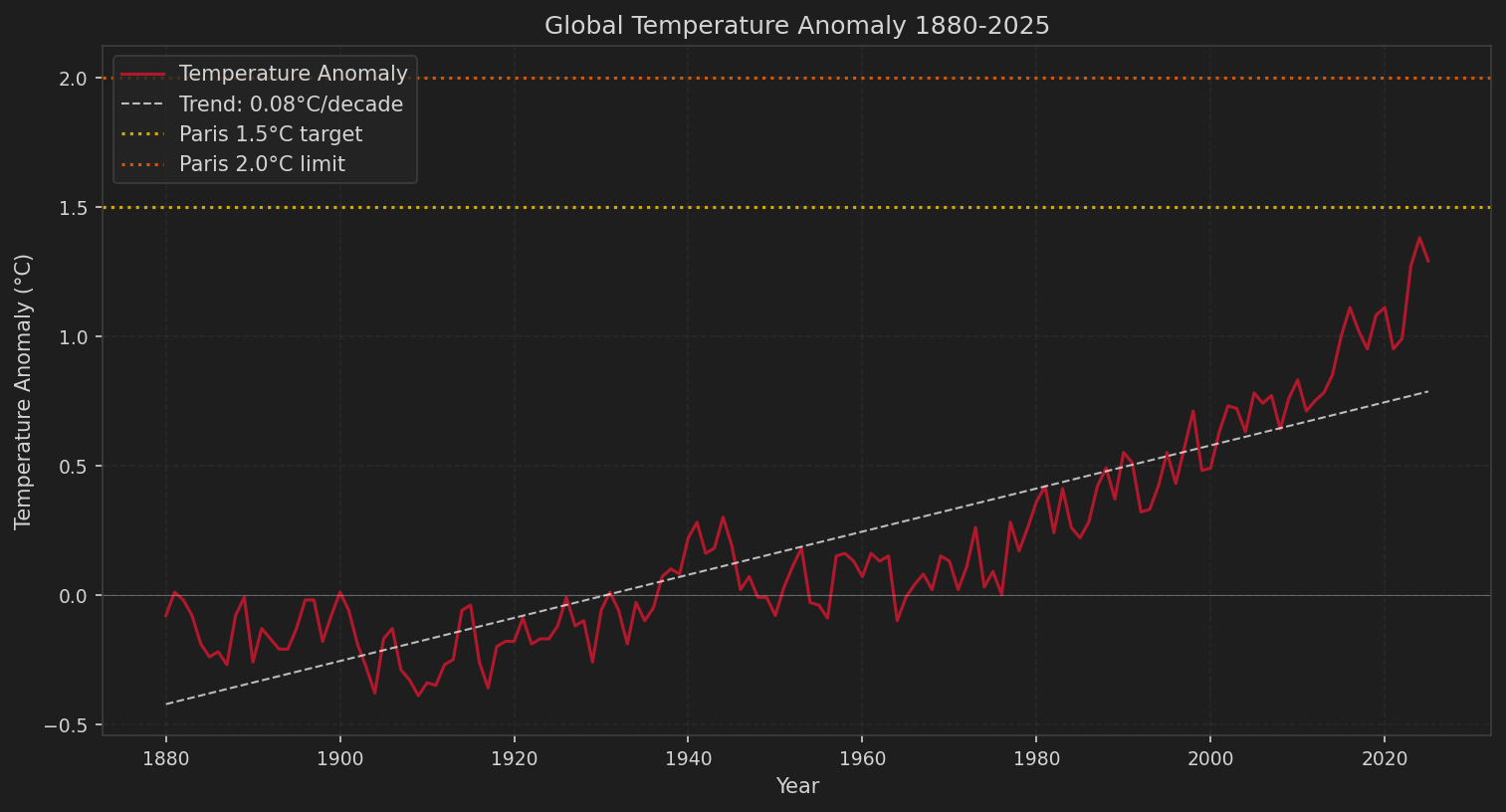
NASA GISTEMP data with trend line and Paris Agreement targets (1.5°C and 2.0°C).
1880-2025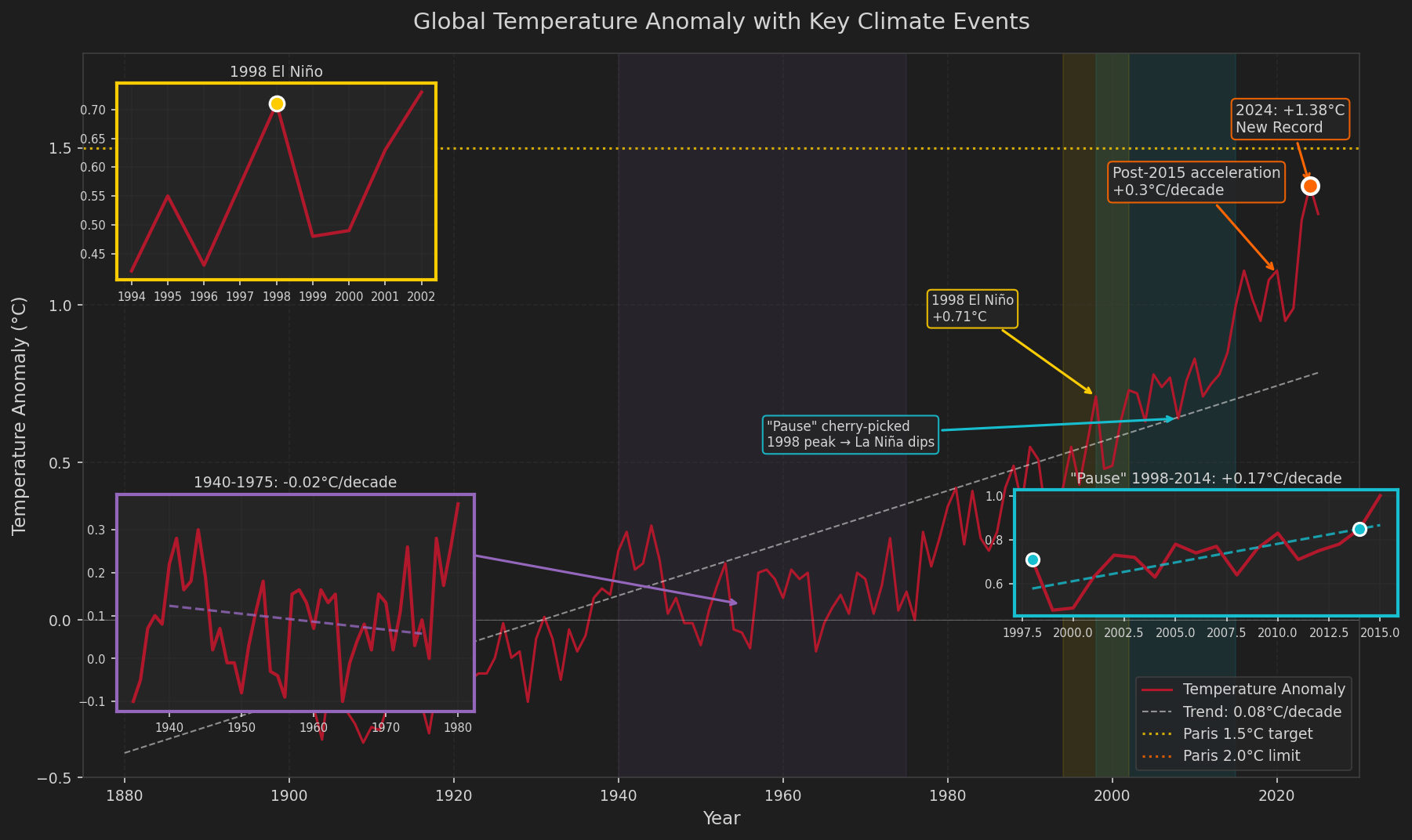
Three zoomed insets: 1940-1975 "cooling" (aerosols, papers 44:7 warming), 1998 El Niño spike, and the "pause" (+0.17°C/decade). Data-driven responses to common denial arguments.
1880-2025 with insets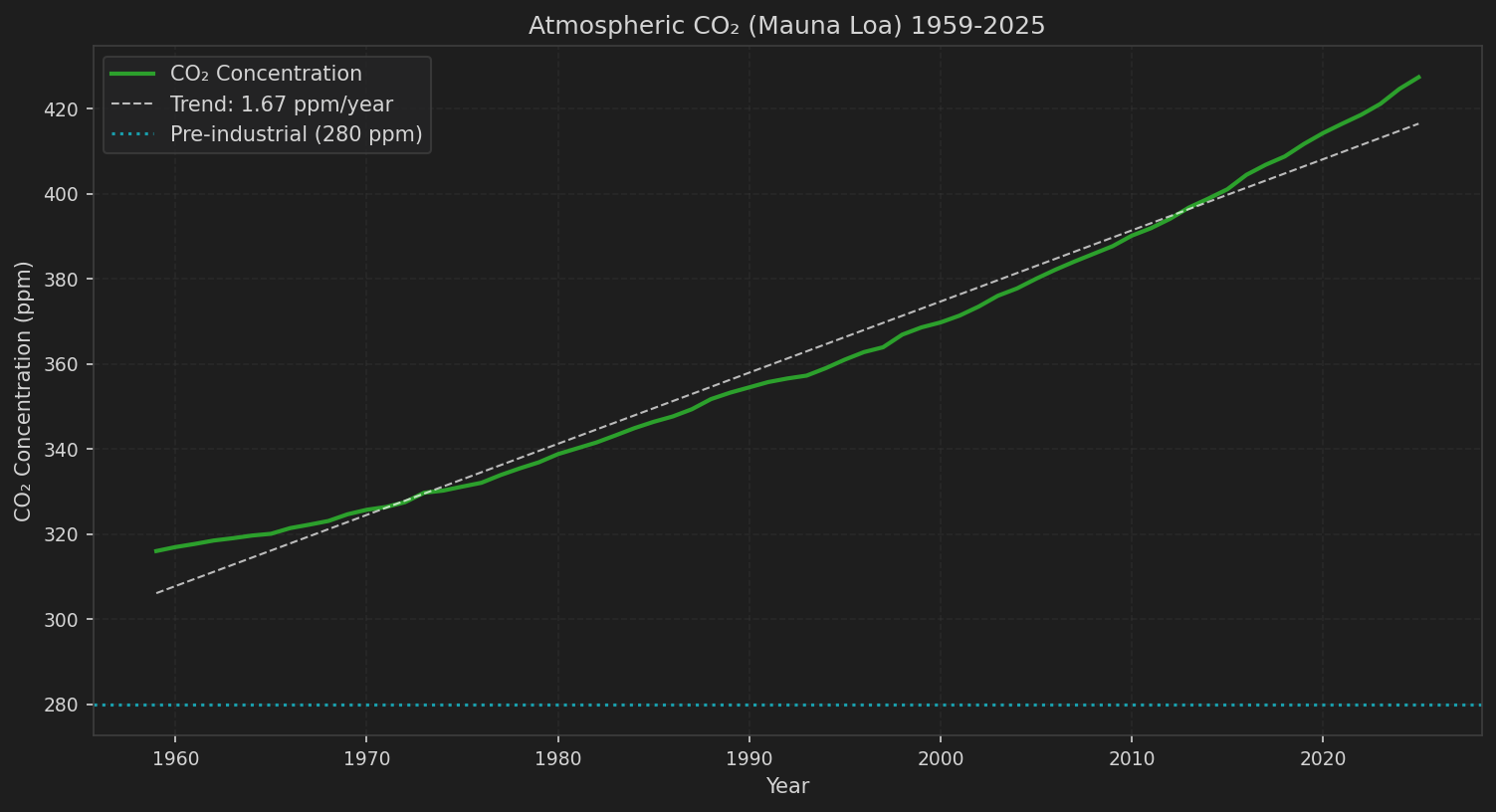
NOAA Mauna Loa measurements. Cyan line shows pre-industrial level (280 ppm).
1959-2025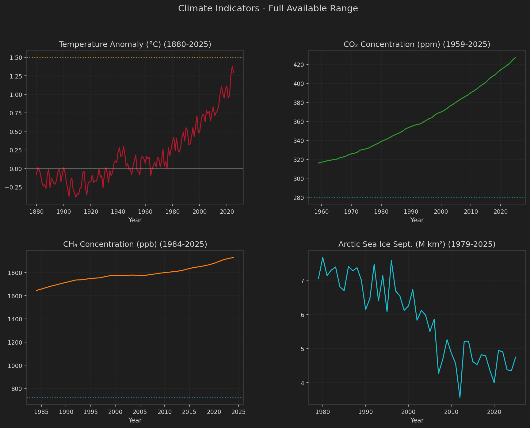
Four-panel view: Temperature (1880-), CO2 (1959-), Methane (1984-), Arctic Ice (1979-). Each panel shows its complete available data range.
Full range per indicator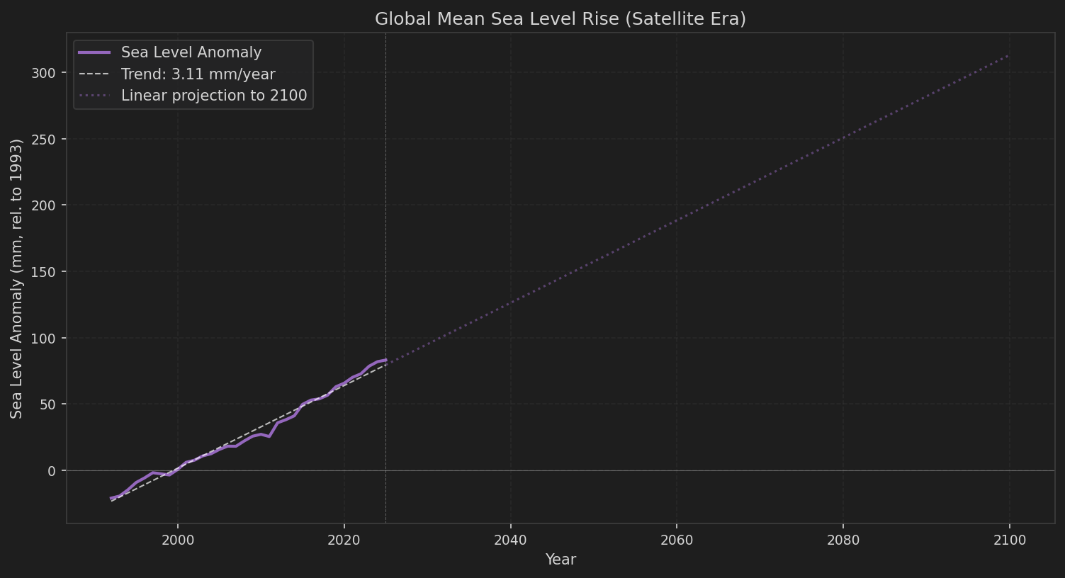
Satellite altimetry data with linear projection to 2100. Current rate: ~3.4 mm/year.
1992-2025 (satellite era)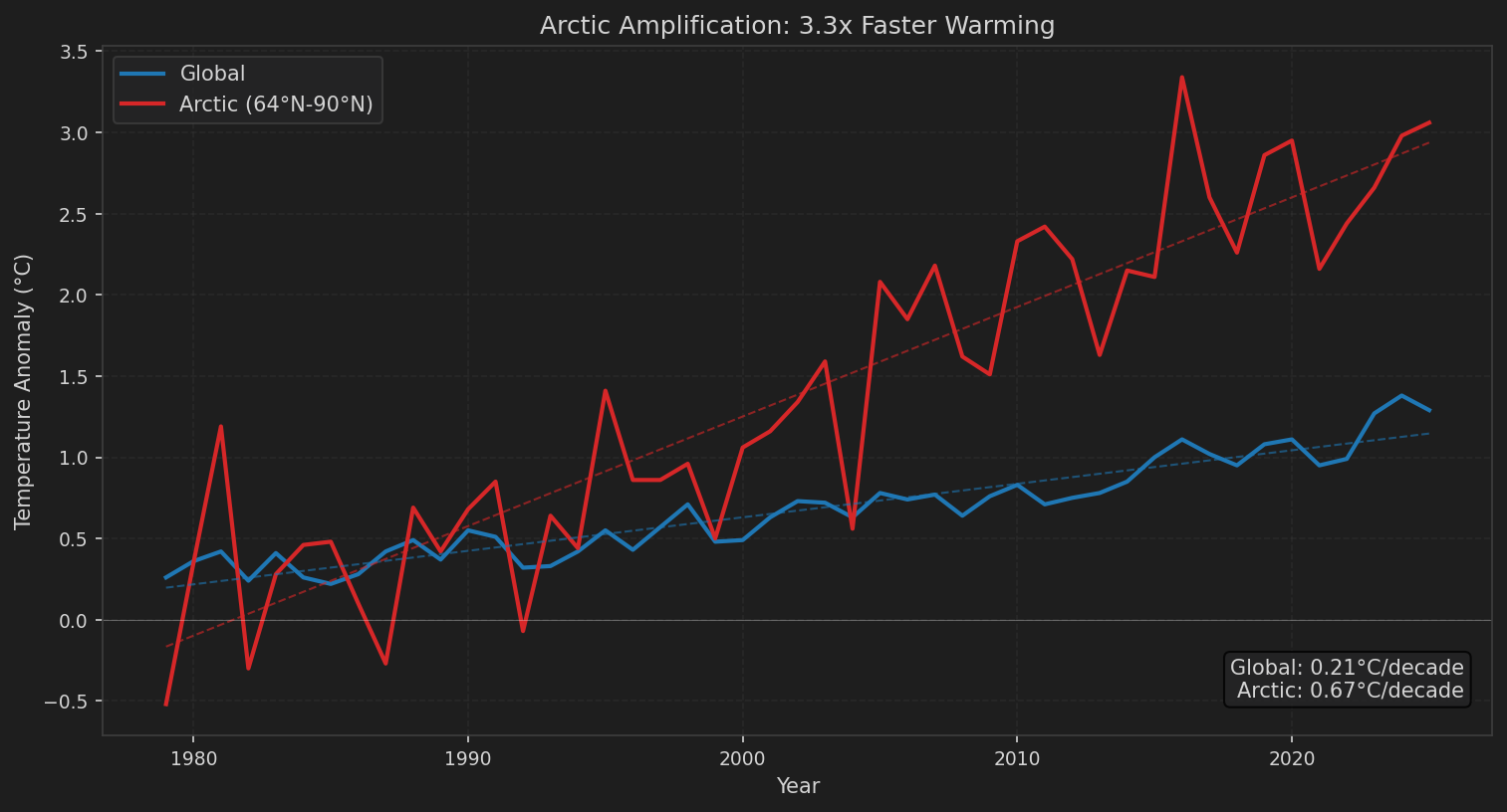
Arctic (64°N-90°N) warming vs global average. Arctic warming at 2-3x the global rate.
1979-2025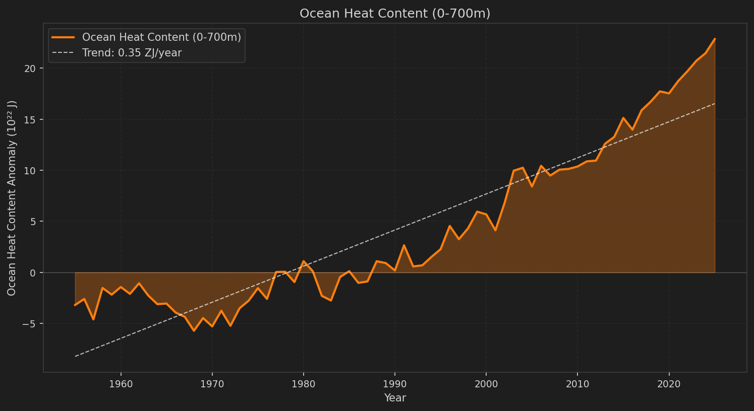
Upper ocean heat content anomaly. Ocean has absorbed 90%+ of excess heat.
1955-2025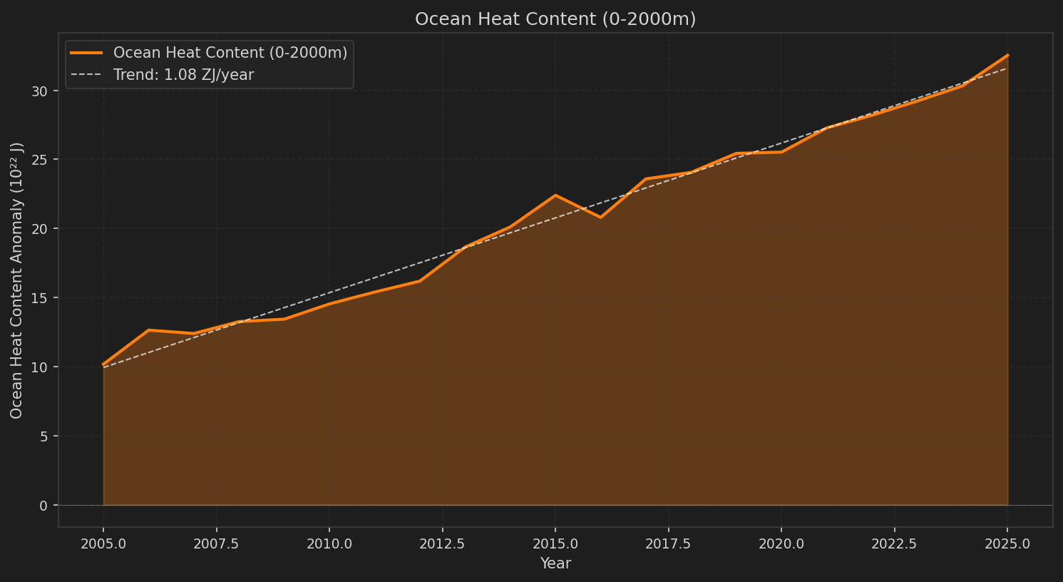
Deep ocean heat content from Argo float network.
2005-2025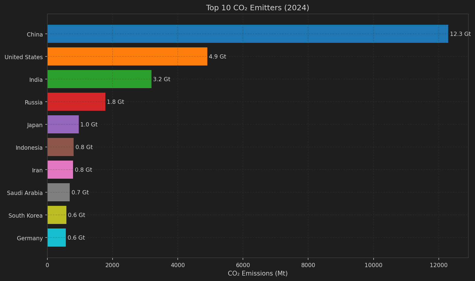
Annual CO2 emissions by country. China leads at ~12 Gt, followed by US at ~5 Gt.
2024 data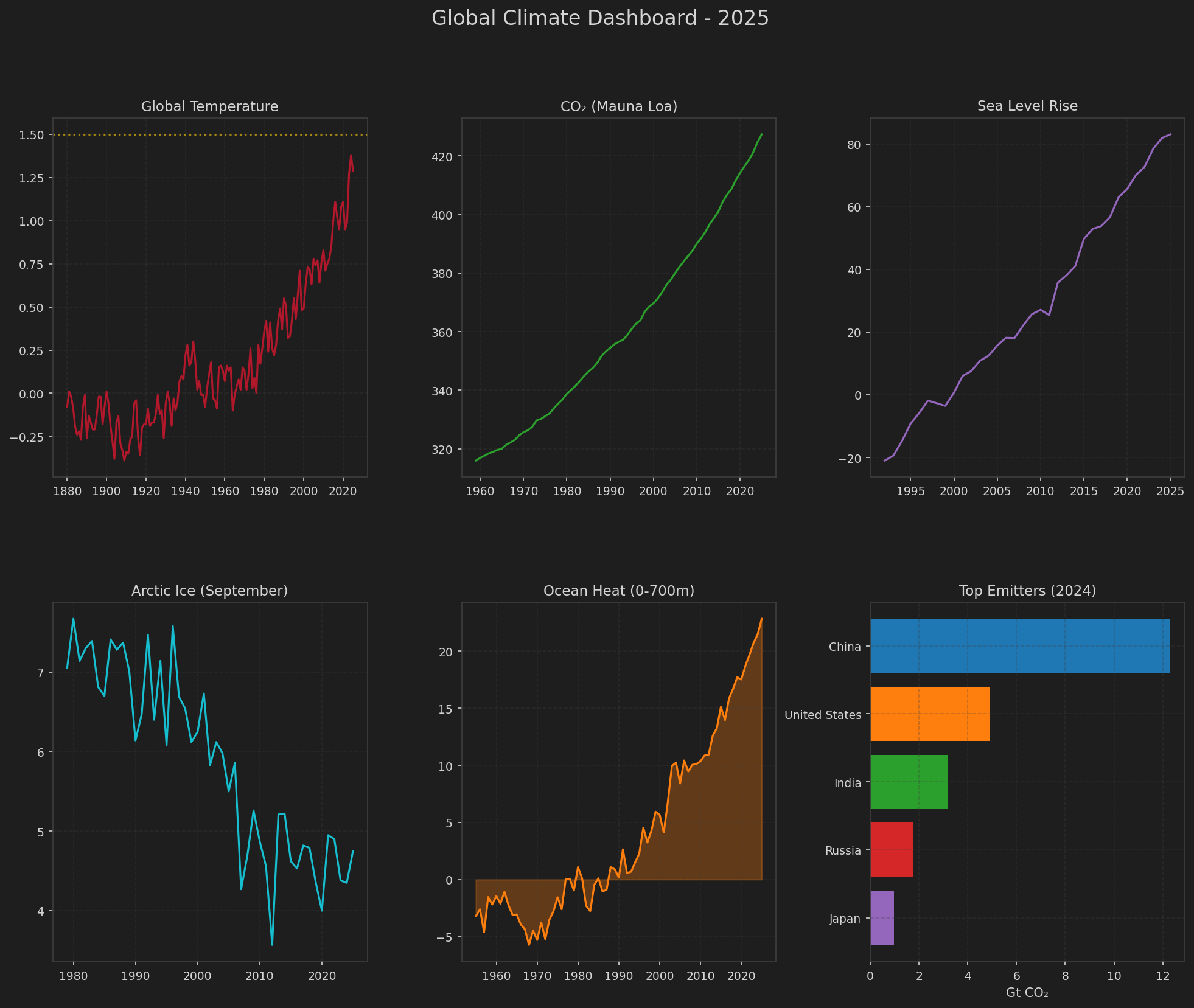
Six-panel overview: Temperature, CO2, Sea Level, Arctic Ice, Ocean Heat, and Top Emitters.
2025 DashboardThese visualizations are generated by the 9 tools in GlobalTemperature variation_8:
| Tool | Description | Data Source |
|---|---|---|
plot_temperature_trend |
Temperature anomaly time series with Paris targets | NASA GISTEMP |
plot_temperature_annotated |
Annotated chart with zoomed insets for 1998 El Niño and "pause" period | NASA GISTEMP |
plot_co2_trend |
CO2 concentration (Keeling curve) | NOAA Mauna Loa |
plot_warming_stripes |
Ed Hawkins-style warming stripes | NASA GISTEMP |
plot_multi_indicator |
4-panel climate indicators (full_range option) | Multiple |
plot_sea_level_trend |
Sea level rise with 2100 projection | NOAA LSA |
plot_emissions_comparison |
Top emitters bar chart | OWID/GCP |
plot_arctic_amplification |
Arctic vs global warming comparison | GISTEMP Zonal |
plot_ocean_heat_trend |
Ocean heat content (0-700m or 0-2000m) | NOAA NCEI |
plot_climate_dashboard |
6-panel comprehensive dashboard | Multiple |
plot_multi_indicator({'full_range': True}) - Generate multi-indicator panel showing each dataset's complete available history.